


サイトで吹き出しの装飾ってよく見かけますよね。
どうやってできているのか気になったことはありませんか?
特に吹き出しの三角部分。。
ということで、今回は簡単な吹き出しを作ってみたいと思います。
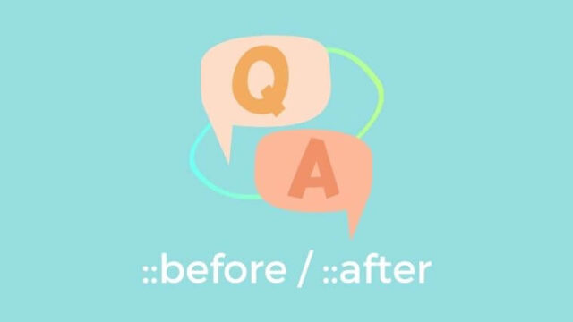
吹き出しの三角部分の正体は?
実はCSSの擬似要素(::before or ::after)とborderを組み合わせてできています。
でもどうしてそれが三角になるんでしょうか。。あまりぴんときませんよね。
どうして三角形になるの?
borderはborderをを適用する要素そのものに幅と高さがない場合、
border-widthによって、
border-top(▼)、border-right(◀︎)︎、border-bottom(▲)、border-left(▶︎)の
4つの三角形が組み合わさった四角形になっています。
吹き出しの三角のデザインにあわせて、
残したい方向以外のborderの色をtransparent(透明)にし、
1箇所だけ色を指定することで三角にみえるという仕組みです。
三角の位置は、
position:absolute; + top, bottom, right, leftを組み合わせて調整します。
吹き出しの作り方
HTMLの書きかた
用意するタグ:divタグのみでOK
中身の文字も入れる場合はpタグなども追加します
CSSの書きかた
【div本体:吹き出しの文字が入る部分の装飾】
- position: relative; ←擬似要素はposition: absoluteで三角の位置を調整するため。
- 吹き出し本体の大きさを指定(widthやheight)
- background: 吹き出しの色;
【div擬似クラス(::before or ::after):吹き出しの三角部分を装飾】
- position: absolute;
- content: “”;
- top, bottom, left, rightで位置を調整
- border: 太さを指定 solid transparent;
- border-方向-color: 三角部分の色を指定;
【具体例】下に三角のついた吹き出し
例として、よくある下に三角のついた吹き出しを作ってみました。
少しborder-radiusをつけて吹き出しの角丸をつけています。
See the Pen
MWwxQXo by orange (@orange-notebook)
on CodePen.
HTML
<div class="speech">
  <p>
    吹き出しです!
  </p>
</div>
CSS
今回、Sass(SCSS)で書いています。
* {
  margin: 0;
  padding: 0;
  box-sizing: border-box;
  font-family: arial, sans-serif;
}

.speech {
  margin: 30px;

  // 吹き出しの本体のデザイン
  position: relative;
  width: 200px;
  height: 100px;
  background: orange;
  border-radius: 5px;

  // 吹き出しの中の文字を中心に配置
  display: flex;
  justify-content: center;
  align-items: center;

  // 吹き出しの三角部分
  &::after {
    position: absolute;
    content: "";

    top: 100%;
    left: 50%;
    transform: translateX(-50%);

    border: 1rem solid transparent;
    border-top-color: orange;
  }

  // 吹き出しの中身の文字
  p {
    color: white;
    font-size: 1.2rem;
    font-weight: bold;
  }
}
以上、吹き出しの作りかたでした。